WISDOLIA
Overview:
Wisdolia is an AI-generated flashcard app that aims to aid students in exam preparation and is considering integrating a new feature for collaborative learning and mutual support.
In this project, I redesigned the app by streamlining the user flow and adding features to enhance students’ learning experiences.
-
UI/UX Designer, Interaction Designer
-
Research, Wireframing, Usability Testing, Interaction Design, High-Fidelity Prototype.
-
Figma, Adobe Suites
-
December - January 2024
UNDERSTANDING THE PROBLEM
Students feel overwhelmed with the volume of information they need to learn and lack effective tools to organize, recall, and personalize their study materials. Existing flashcard apps provide limited ways to study (only to quiz them), and customization, and don't address the need for accountability and collaboration, hindering students from reaching their full learning potential.
Solution
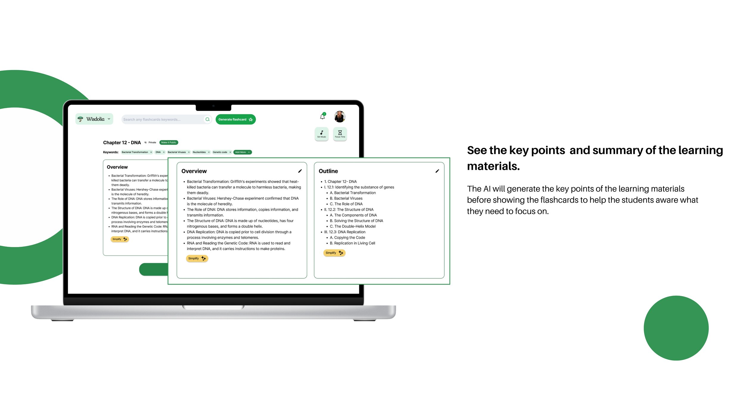
I redesigned the app by providing multiple new features. Firstly, the AI will generate key point summaries from uploaded articles and documents, providing quick overviews of complex materials. Secondly, the AI will also generate diverse quiz questions based on flashcard content, offering additional ways to test knowledge. Last but not least, the built-in study partner feature will facilitate shared flashcards and quiz competitions, fostering accountability and peer-to-peer learning.
GATHERING INSIGHTS
User Survey
I began the project by seeking personal anecdotes and looking at user survey about feature request to understand users’ experiences, pain points, and needs with Wisdolia.
New App Features & User Stories
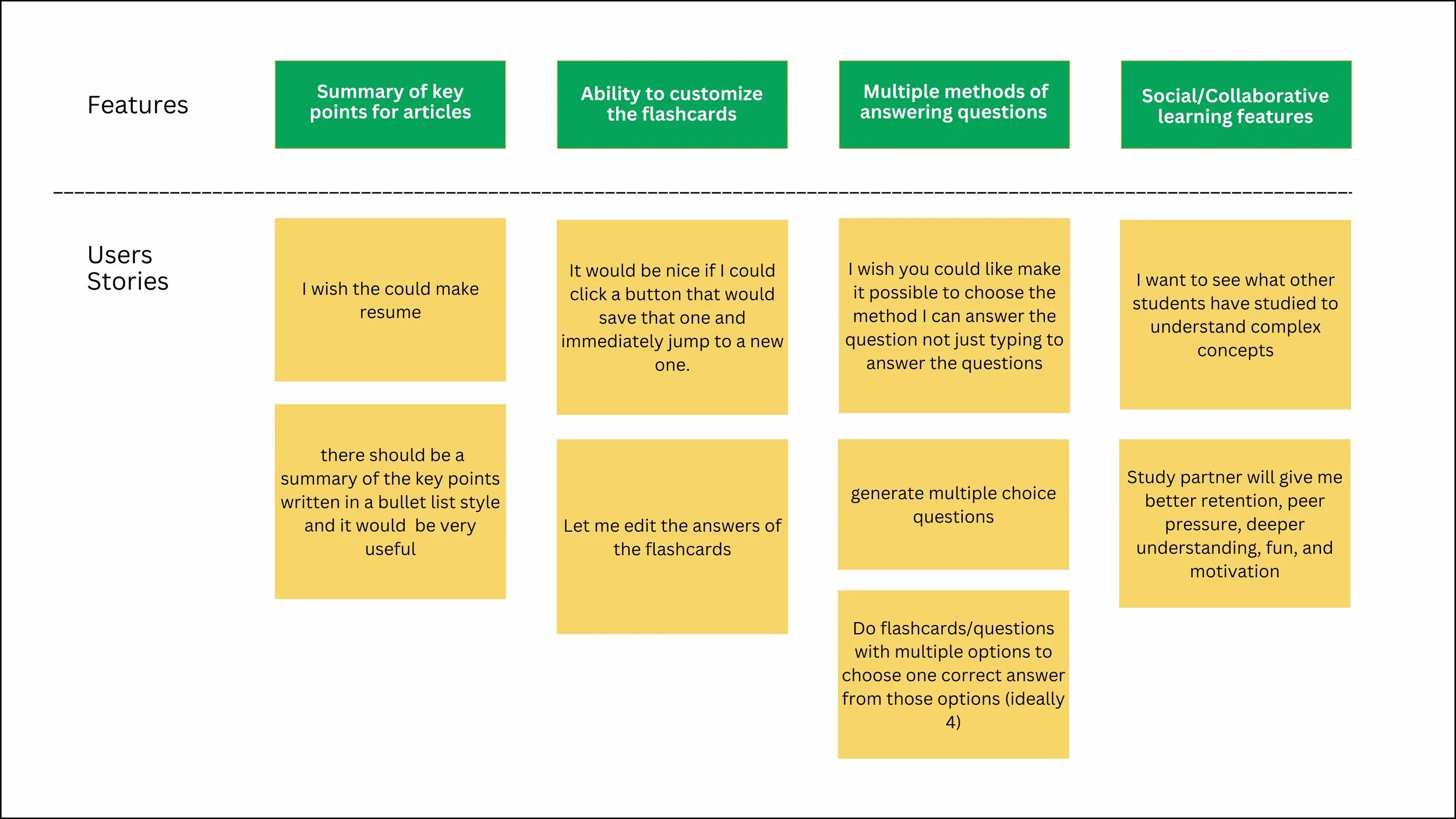
After gathering my research, I identified four key features that would improve the user experience of the app. I created a chart of the features and wrote user stories highlighting when people would use them. This served as a gut check throughout the process to make sure that the new designs were addressing these stories.
Design
Sitemap
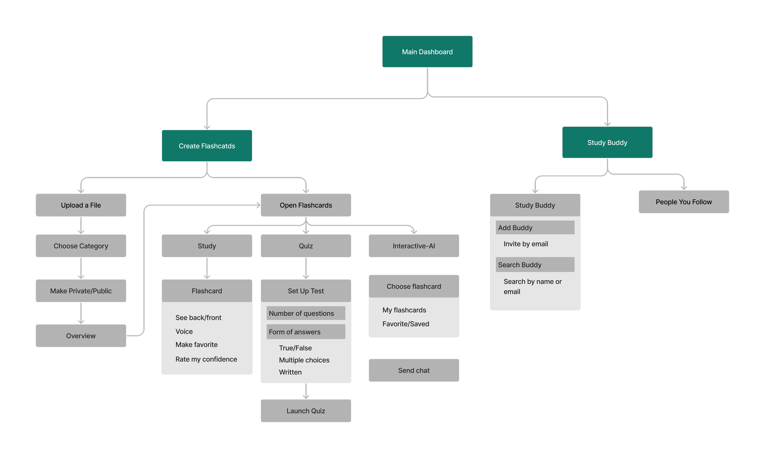
To figure out how and where to add the new features, I walked through the entire app to understand the information architecture and user flow that already exists. I created a sitemap of the current app and then determined the best, most intuitive places to add the features in.
Wireframes
To figure out how and where to add the new features, I walked through the entire app to understand the information architecture and user flow that already exists. I created a sitemap of the current app and then determined the best, most intuitive places to add the features in.
Hi-Fidelity Design
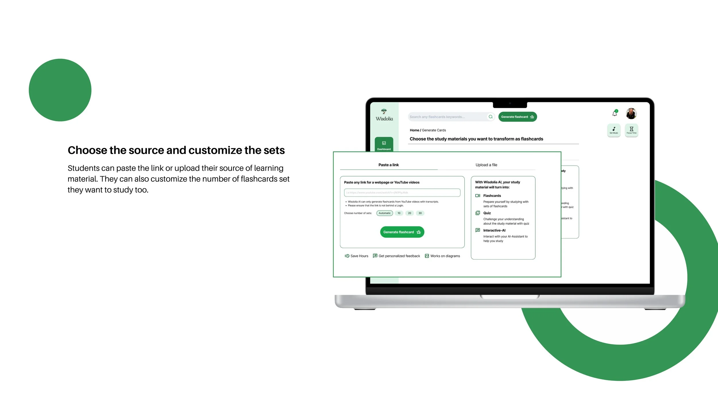
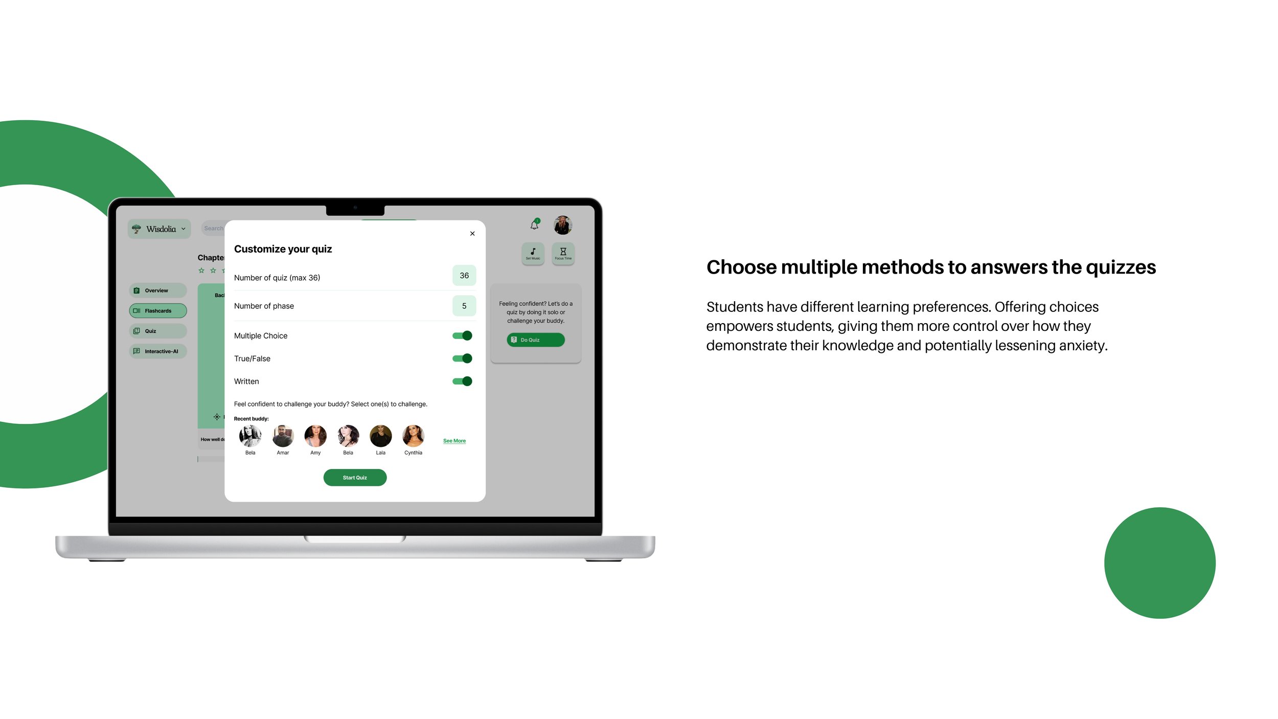
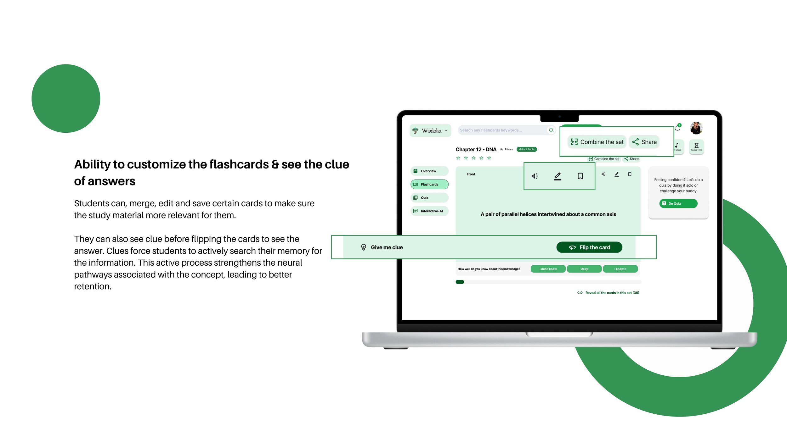
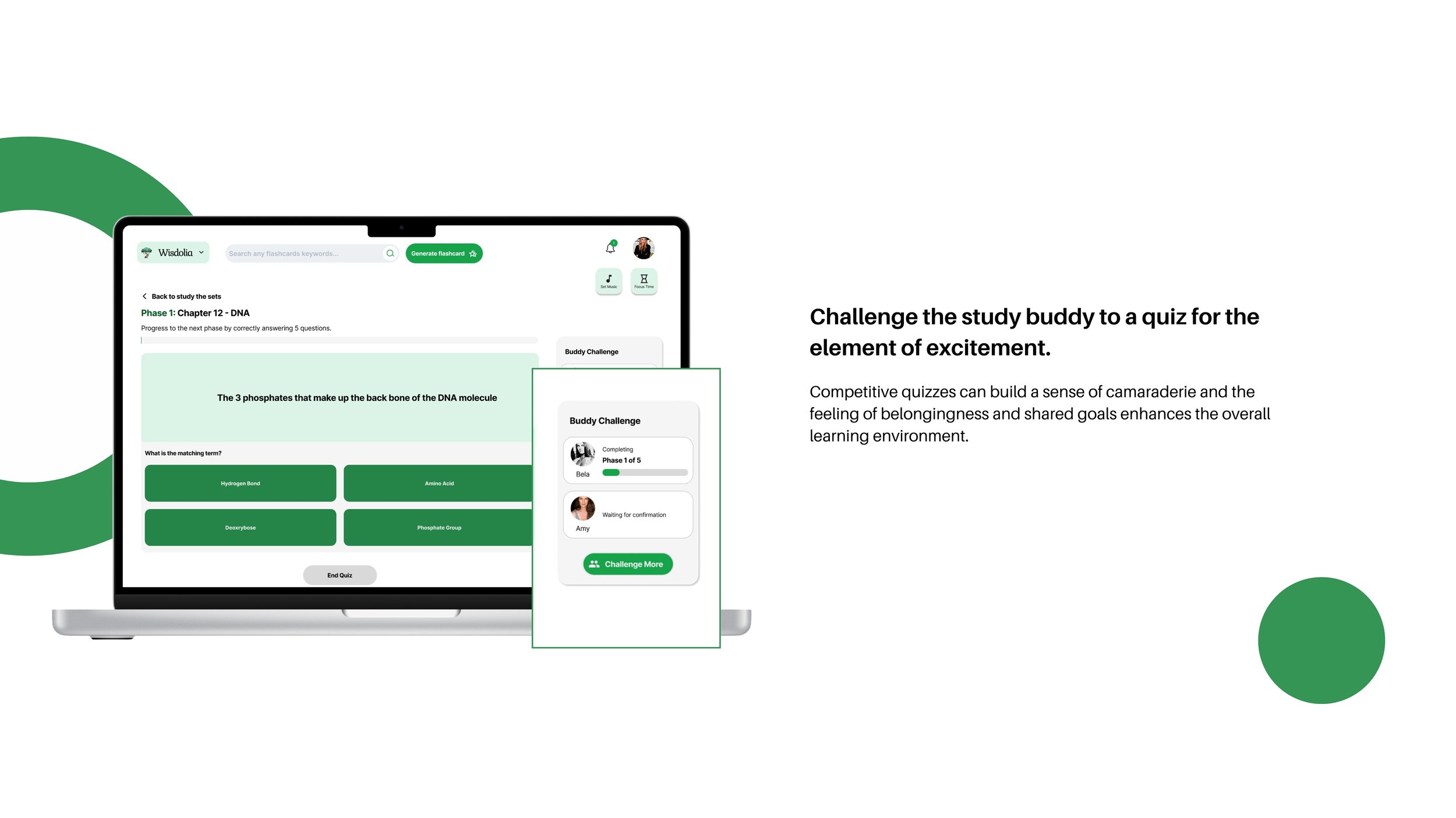
This final prototype embodies our commitment to understanding student needs. We've meticulously addressed their pain points with intuitive navigation, streamlined flashcard creation, and AI-generated summaries that save valuable time. The option to choose answer formats and connect with study partners puts learners in the driver's seat, fostering engagement and deeper understanding.


