ADMIN MOBILE APP
Overview:
Designing a user-friendly mobile app that translates the functionality of a complex educational dashboard into a streamlined mobile experience for course and exam license management. In this UX case, we focus on designing the feature for Manage and Allocate Licenses.
-
UI/UX Designer, Interaction Designer
-
Research, Wireframing, Usability Testing, Interaction Design, High-Fidelity Prototype.
-
Figma, Adobe Suites
-
June - July 2023
UNDERSTANDING THE PROBLEM
Our current course and license management system relies on a web-based dashboard. While functional on desktops, this approach suffers when accessed on mobile devices.
Challenge:
The current web-based dashboard is not optimized for mobile devices. Users struggle with accessing and managing information on a smaller screen, impacting their ability to effectively manage courses, licenses, and personnel.
Target Audience:
This application will target administrators and teachers responsible for managing course and exam licenses for their students.
Solutions:
Optimizing for Mobile: The user interface will be designed specifically for touch interactions and clear information presentation on smaller screens.
Simplified Navigation: Menus and actions will be streamlined for quick and intuitive navigation on a mobile device.
Improved Data Accessibility: Information will be organized and displayed clearly, minimizing scrolling and maximizing data visibility.
GATHERING INSIGHTS
USER PERSONA
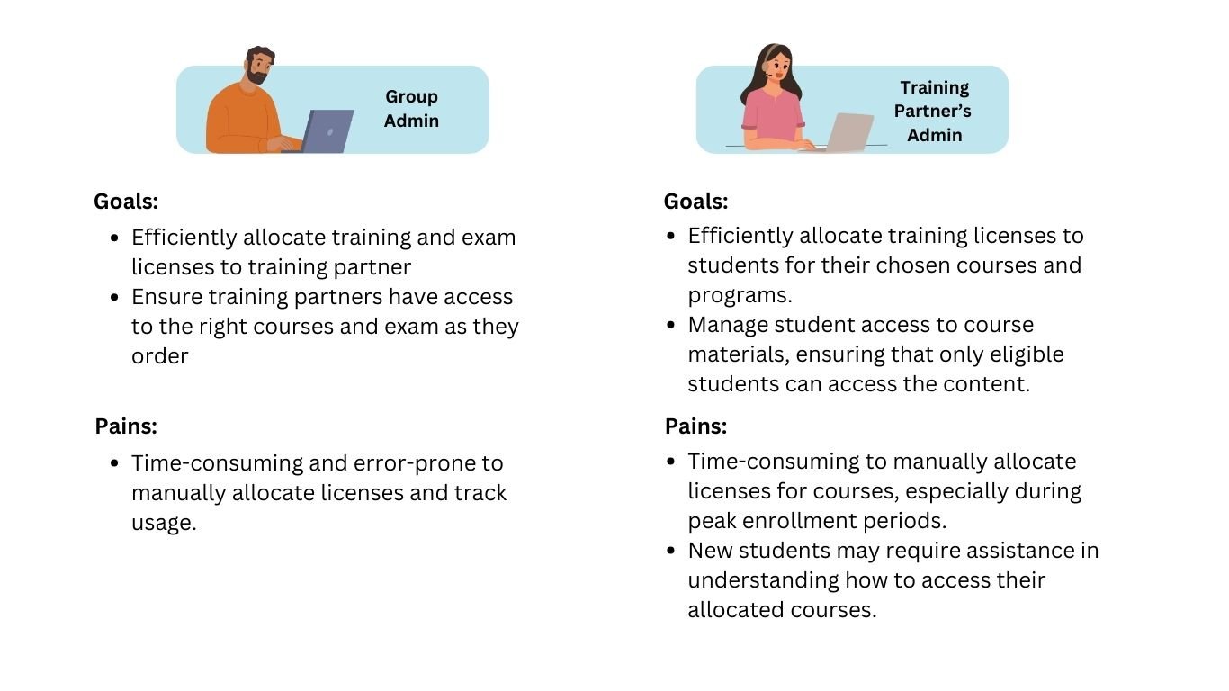
In order to have a better understanding of the target user of this product, I created provisional personas to know their needs and preferences, facilitating more user-centered design and decision-making processes.
USER JOURNEY MAP
Based on the data I gathered and my analysis of the current desktop version, I created the user journey map for the mobile version, outlining my envisioned user experience. This eventually evolved into an experience map, documenting user journeys and emotional responses at every interaction point within the app. By understanding user needs and pain points at each touchpoint, we can design an app that anticipates their requirements and streamlines their workflow.
VISIONING THE APP
APPLICATION MAP
Understanding how users navigate an app is crucial for crafting a seamless and intuitive experience. I then designed an application map for the Stooper app, outlining the key screens and their functionalities. I want to ensure the app will allow users to search for items, explore listings, connect with other users, and arrange pick-ups.
TASK FLOW
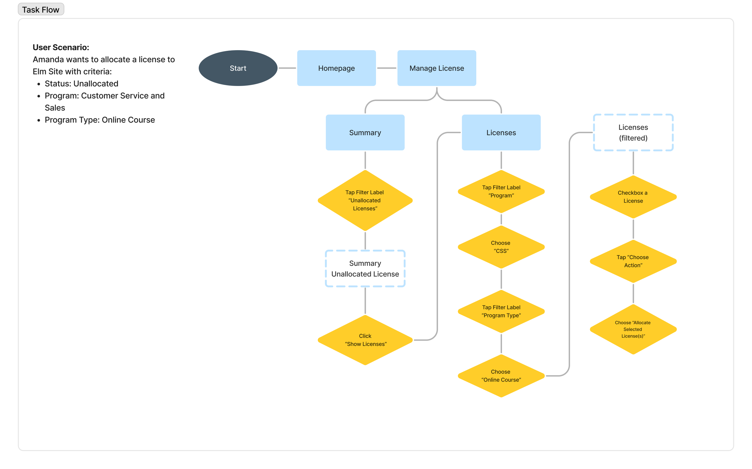
Understanding how users navigate an app is crucial for crafting a seamless and intuitive experience. I then designed an application map for the Stooper app, outlining the key screens and their functionalities. I want to ensure the app will allow users to search for items, explore listings, connect with other users, and arrange pick-ups.
INITIAL HI-FIDELITY DESIGN
In this design process, it is not as smooth as expected. The application map and task flow above are based on the final product. But in this UX Case, I also want to show the initial design. I want to show this part, so we can see my journey in the design process which is not always smooth sailing. I believe the key to good design is listening to our users and clients, being open about iteration, and never giving up on innovating.
ITERATION FOR BETTER USER EXPERIENCE
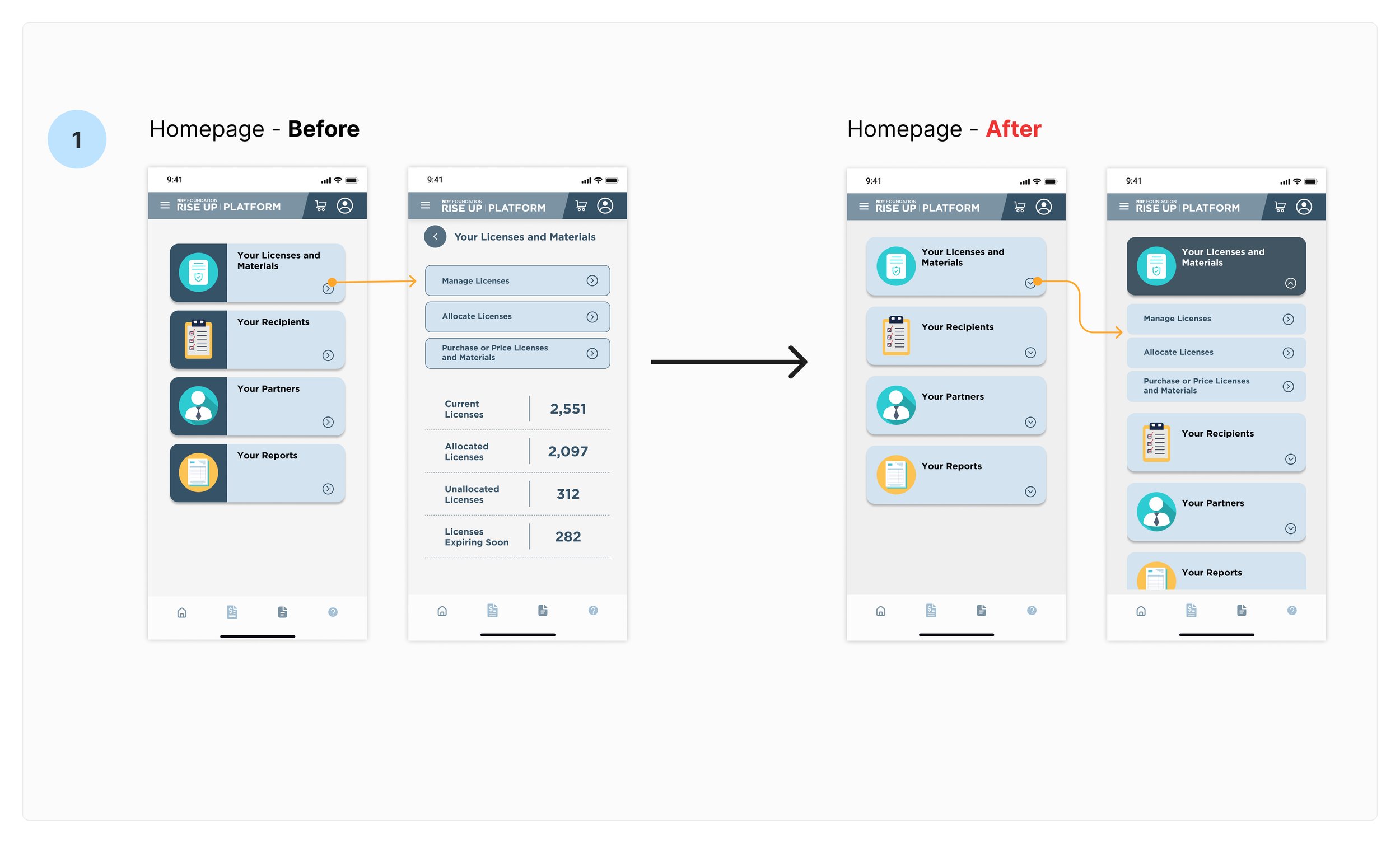
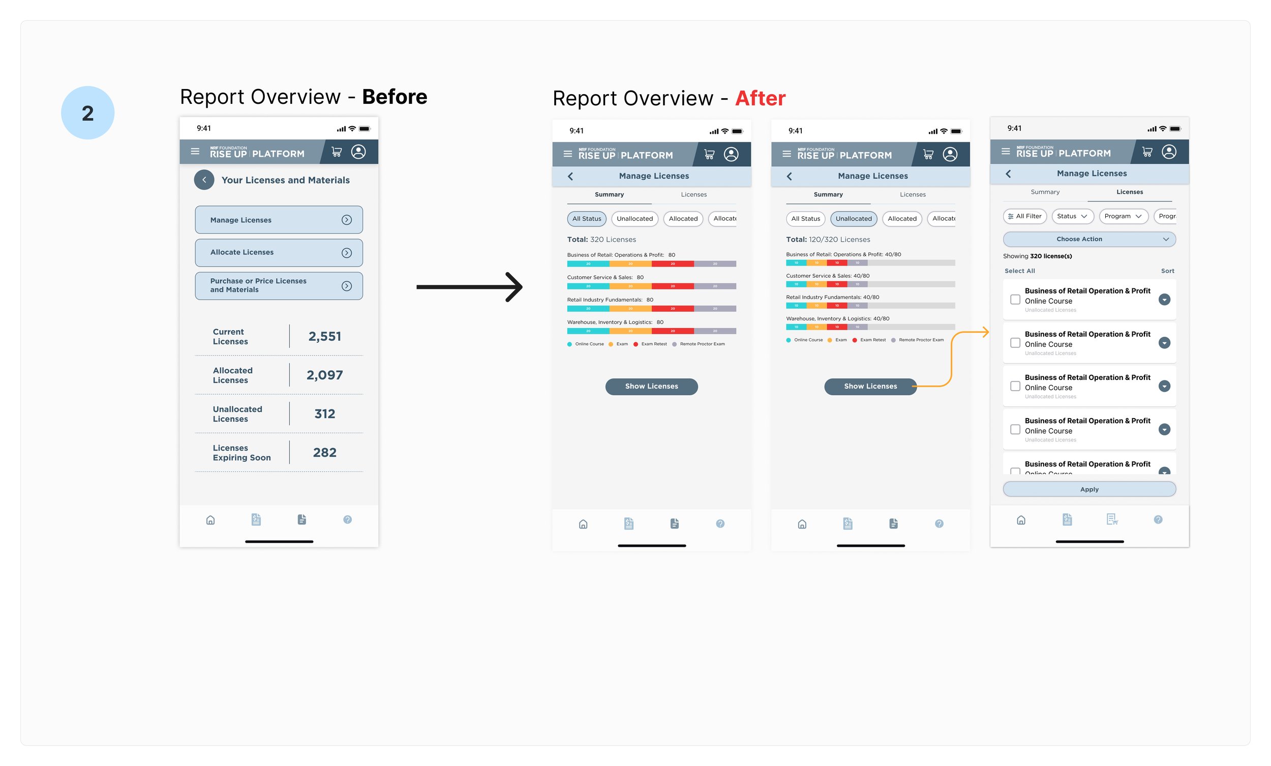
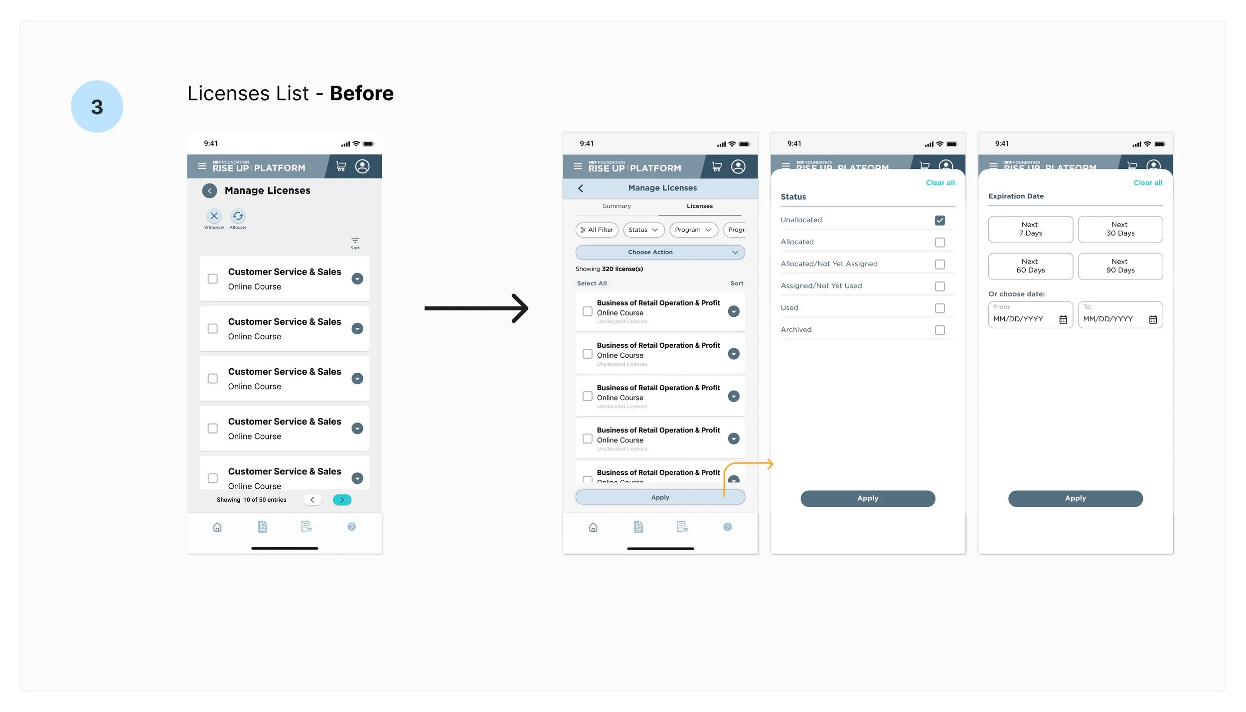
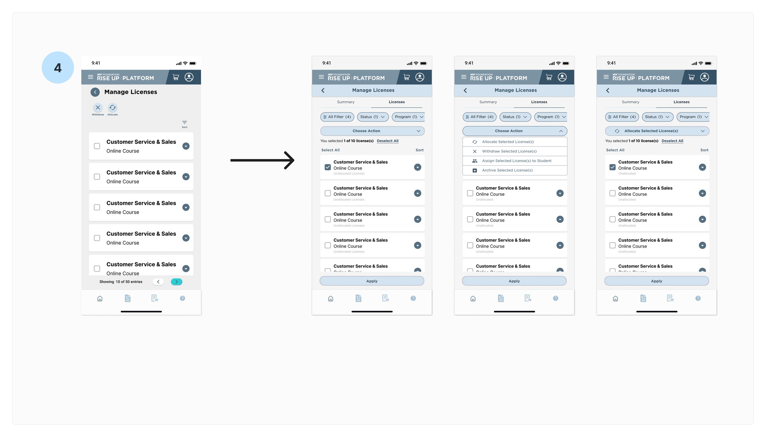
After conducting internal testing, we found that the initial design has the potential to overwhelm users. Some insights after collecting the feedback and discussing with the team:
Simplify steps on the Homepage
Implement a better Overview Report
Implement a more efficient filter to help users easier to see the License list as intended
Implement a better flow for users to do the intended action
Understanding how users navigate an app is crucial for crafting a seamless and intuitive experience. I then designed an application map for the Stooper app, outlining the key screens and their functionalities. I want to ensure the app will allow users to search for items, explore listings, connect with other users, and arrange pick-ups.
FINAL PROTOTYPE
LESSONs learned & takeaways
Understanding user needs:
Initial user research effectively identified core needs, but ongoing testing revealed unexpected user behaviors requiring design iteration.
Mobile-specific considerations:
Information architecture proved intuitive, but some features required optimization for the mobile format during usability testing.


